
In addition to the main dashboard that shows reports from data collected over time, we have a "live data pulse" dashboard that shows data flowing in more realtime so you can get a quick view on the data coming into the Nalpeiron Analytics Service.
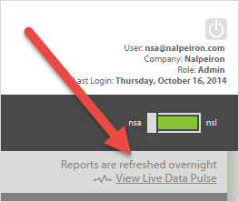
To navigate to the "Live Data Pulse" click on the link in the top right hand part of the screen.
Here's how the dashboard works:
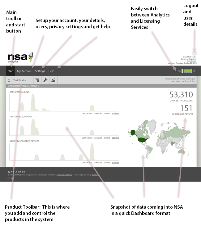
As you can see the main difference to the other dashboards and reports is that you can see data "trending" over a Day, Week or Month.
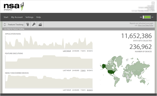
Here is an example of the "live" dashboard showing various trends so you can check on base functionality of the system at any time.
To navigate to the "Live Data Pulse" click on the link in the top right hand part of the screen.
Here's how the dashboard works:
As you can see the main difference to the other dashboards and reports is that you can see data "trending" over a Day, Week or Month.
Here is an example of the "live" dashboard showing various trends so you can check on base functionality of the system at any time.